Tea websites tend to fall into one of two extremes. Some pile on origins, processes and grades until newcomers know even less about what to choose. Others offer a few beautiful plantation photos and a price. What shoppers actually want to know is simple: what does this tea taste like, when should I drink it, and how do I brew it at home?
This breakdown looks at YEXU from the Foundax case library, a fictional everyday loose-leaf tea brand with three teas: Mountain Green, Cloud White and Amber Black. Its approach is to build the brand with landscape photography, then turn choosing a tea and brewing it into interactions on the page.
Why tea websites are hard
- Flavour is hard to put into words. Terms like "chestnut notes" or "lingering sweetness" give newcomers nothing to go on.
- It feels like it has rules. Too much ritual and jargon puts off people who just want to try.
- Brewing decides the experience. The same tea tastes very different at the wrong temperature or time, yet instructions usually hide on the back of the pack.
- Origin stories drift into the abstract. Plantation photos are beautiful but do not answer "which one should I buy".
So the design goal for YEXU is: make tea feel easy. First help visitors find the cup they want today, then show them how to brew it well.
The idea: a little wild, in your everyday
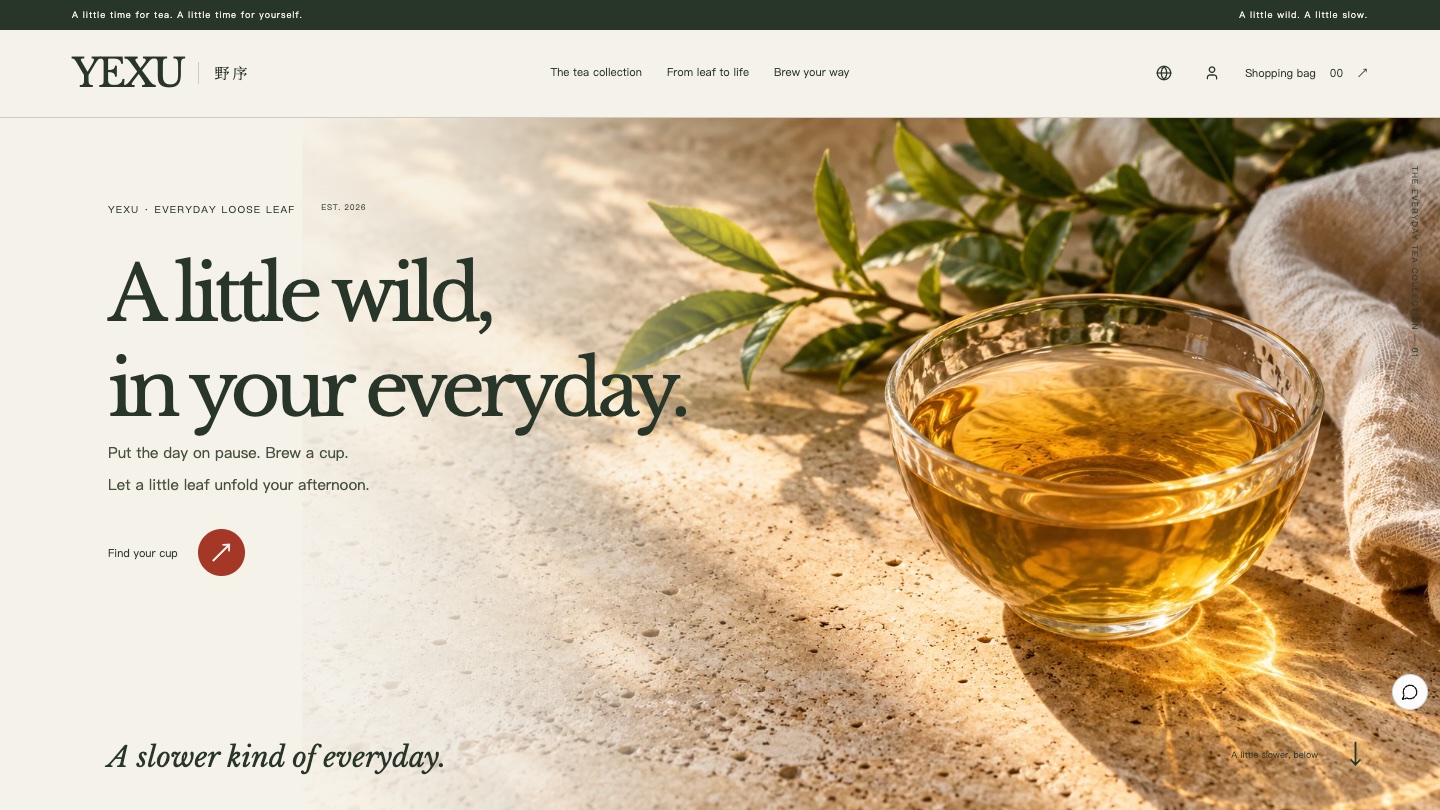
The brand's line is "one leaf, one pour, one moment": no extra ritual, just a little time for yourself in an ordinary day. The first screen is a cup of tea in natural side light rather than a plantation panorama, so the picture starts with the cup in your hand. The landscape photography comes second and tells where the tea comes from.
Visual language: moss, rice paper and one seal red
The page is a warm rice-paper tone with deep moss text. Seal red appears only on key buttons and small stamp-like marks. Each tea has its own liquor colour, and switching teas recolours the flavour chart and the brewing illustration.
- Rice paper
#F5F2E9Page background - Deep moss
#28362AHeadings, body text and primary buttons - Seal red
#A43725Key buttons and stamp-like marks - Mountain Green liquor
#87974CFlavour and brewing colour for the green tea - Cloud White liquor
#BD963BFlavour and brewing colour for the white tea - Amber Black liquor
#A85D29Flavour and brewing colour for the black tea
| Use | Typeface | Why |
|---|---|---|
| Headings | Noto Serif SC, Songti | A bookish serif suits a slower tone of voice |
| Body and interface | PingFang, Microsoft YaHei | Recipe numbers, prices and buttons need to read clearly |
Four signature moments
Landscape
Where the tea comes from
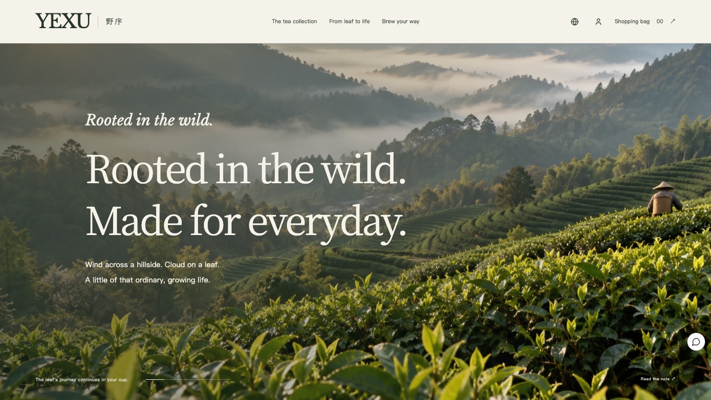
Large landscape photos move with the scroll while the copy hands over inside the frame, telling the story from a leaf to your cup.
Choose
What feels like today?
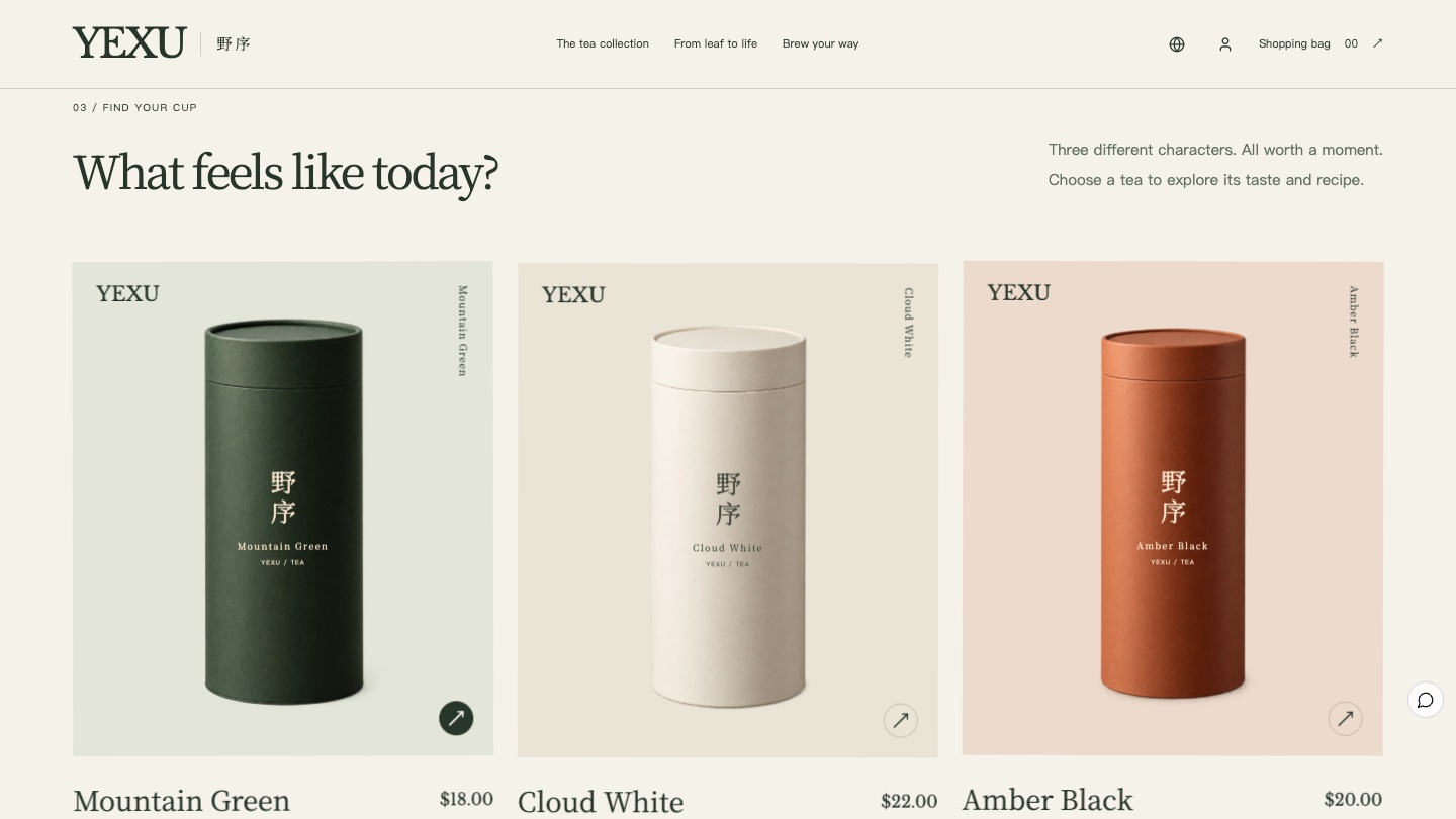
Three teas sit side by side. Choosing one shows a line about its character, flavour words and a scale such as bright, gentle and light.
Brew
Make it your own
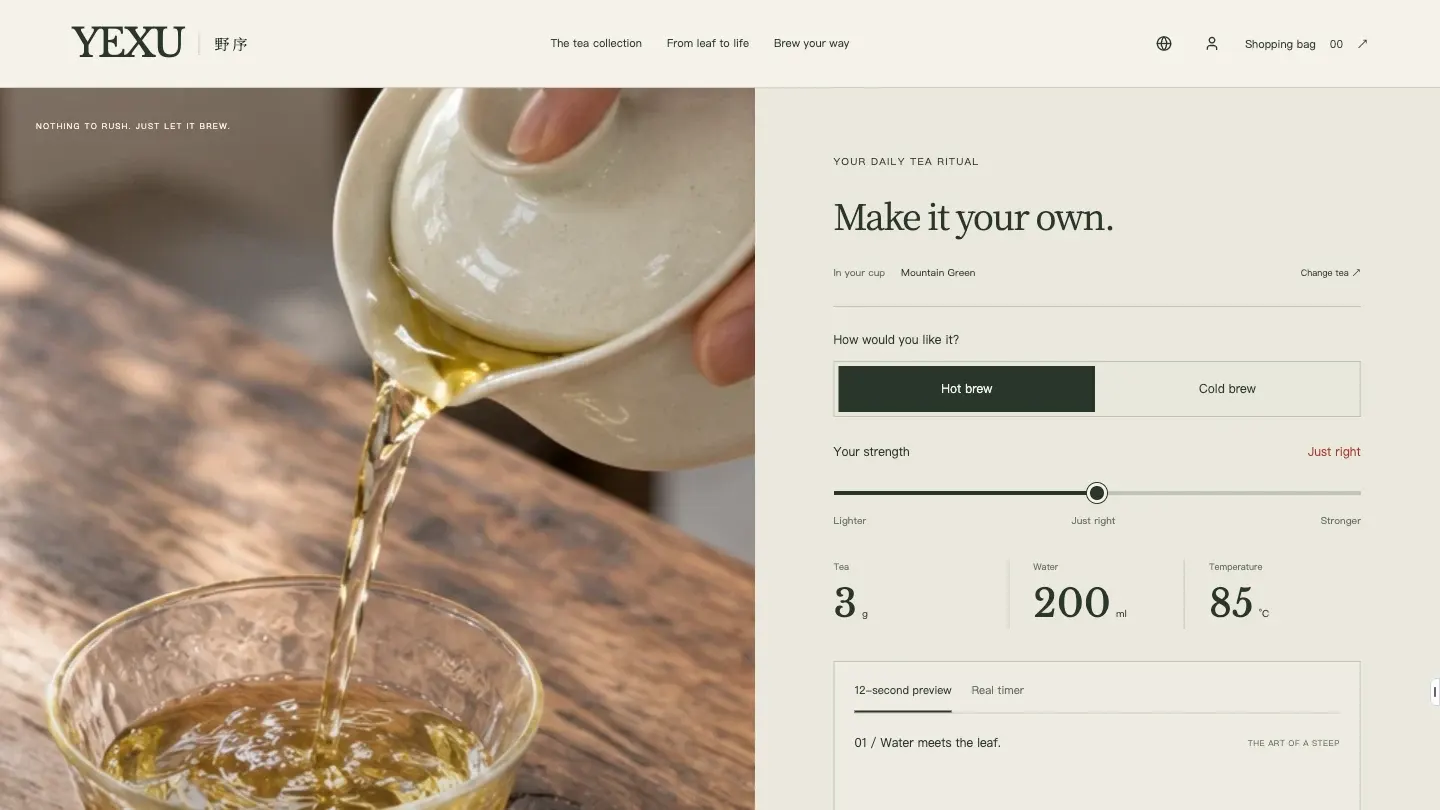
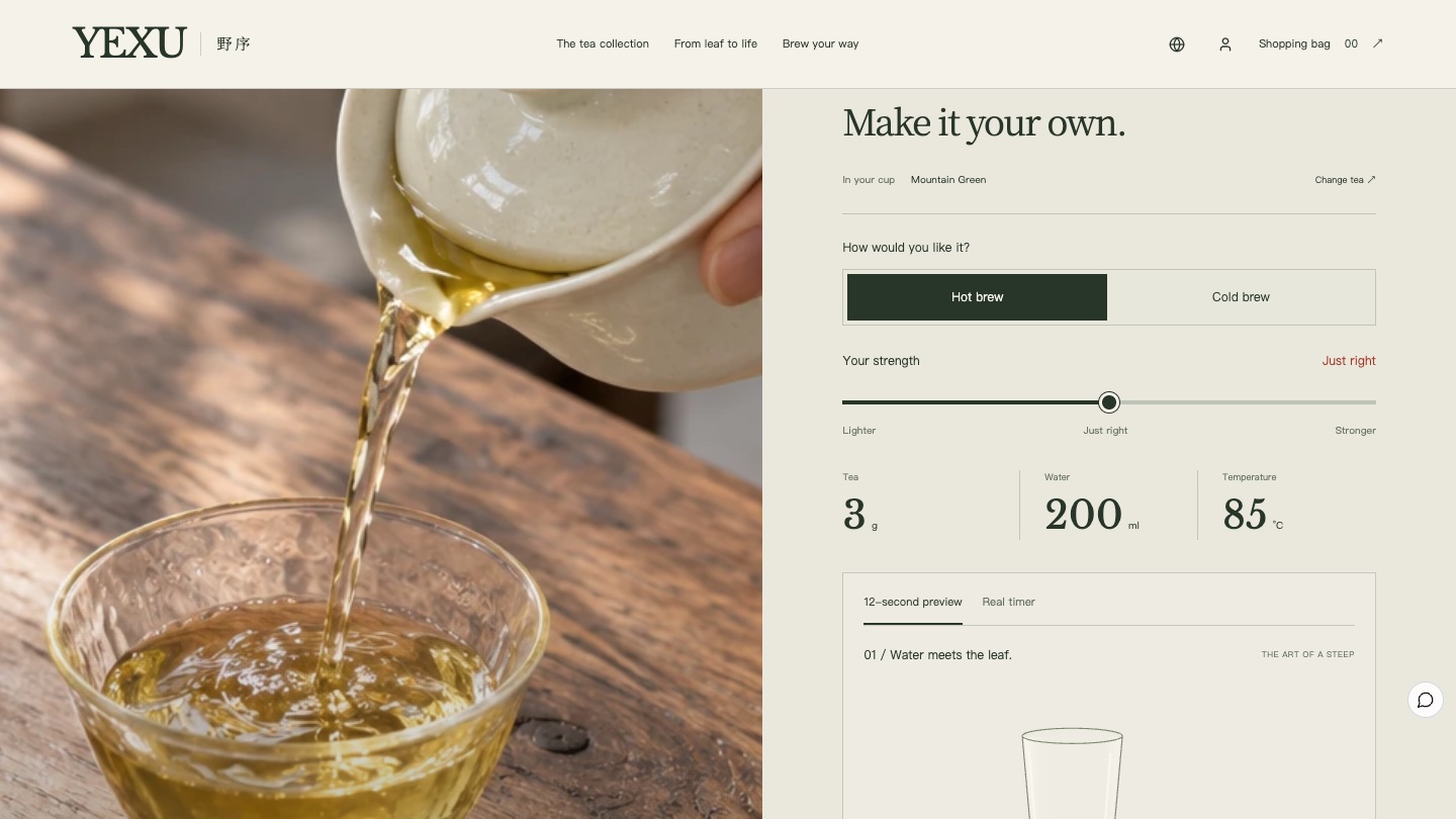
Choose hot or cold brew and drag the strength slider, and the grams of tea, water and temperature update with it.
Timer
Let time bring a little sweetness
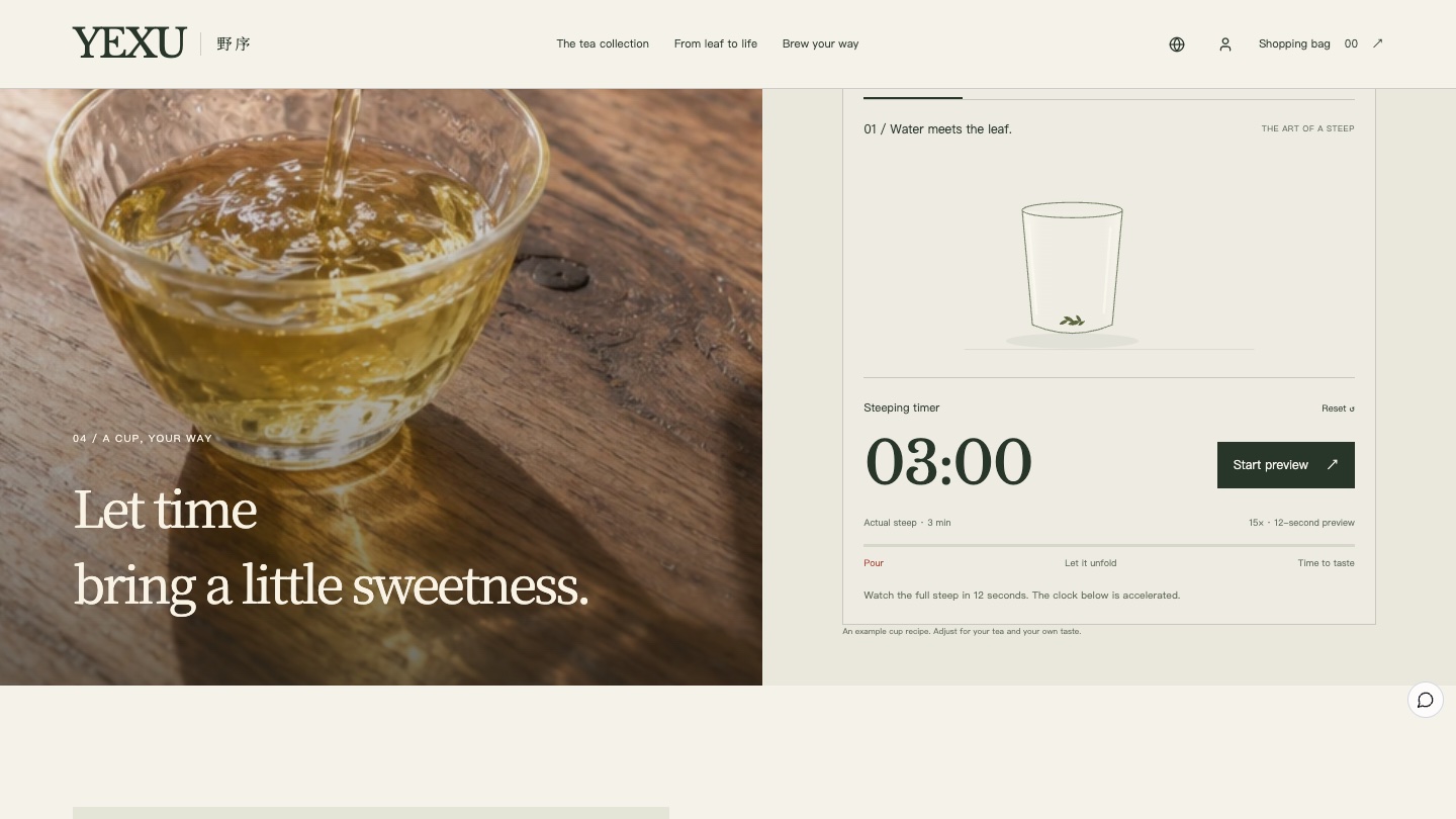
A 12-second preview plays a whole steep, and the real timer counts down in real time so it can be used while brewing.
The six-act storyboard
01
Opening: A little wild, in your everyday
A cup of tea and a few leaves in side light, with the headline and a "Find your cup" button. The picture starts with an everyday cup, not a distant plantation.
02
Origin: Rooted in the wild
A misty tea garden moves with the scroll as the copy hands over. It sets the place and the mood but is not presented as proof of origin.
03
Choose: What feels like today?
Three tins sit in a staggered row, each with a character: fresh, soft or mellow. Choosing one switches the flavour description and scale below.
04
Brew: Make it your own
Beside a photo of tea being poured sits the recipe panel: hot or cold brew, a strength slider and concrete numbers such as 3 g, 200 ml and 85 °C.
05
Timer: Let time bring a little sweetness
The cup illustration slowly changes colour with the timer. The preview shows a whole steep in 12 seconds, and the real timer stays with you while your own cup brews.
06
Shop: A little wild, to take home
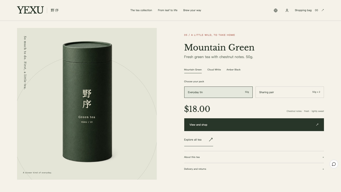
Visitors switch between the three teas and choose an everyday tin or a sharing pair, with the price and a "View and shop" button that leads to the product page.
Being honest about flavour and brewing
Taste varies, so the page states under the flavour scale that descriptions are a guide and everyone tastes differently. The cold brew recipe comes with notes about clean containers, keeping it refrigerated and drinking it promptly. The recipes in the case are examples, and merchants replace them with their own tested numbers.
The landscape photos set the mood but are not proof of origin. The Foundax team made the case images with image generation tools, and the brand name and key Chinese text are set as live text on the page rather than baked into images.
From experience to order
The everyday tins and sharing pairs for all three teas are real products in Foundax. Prices and images in the shop section come from product data, and adding to the bag, discounts, checkout, orders and after-sales use the platform's native features. Recipe preferences are only part of the experience and are not written to the order. With reduced motion turned on, the page keeps all its content and drops only the entrance and scroll animation, following W3C WCAG 2.2 guidance that motion should be possible to turn off. To learn more, visit Foundax features.
A checklist you can reuse
- Start the first screen with the cup in hand and save the origin story for the second act.
- Describe flavour with one line of character, a few key words and a simple scale.
- Turn brewing into an adjustable recipe instead of small print on the back of the pack.
- Give the timer a fast preview so visitors understand the whole process in seconds.
- State the limits of flavour notes, recipes and origin photos.
- Follow the experience straight away with the size choice and a way to buy.
FAQ
Does a tea website need a brewing tool?
Not necessarily, but brewing is one of the biggest factors in how a tea tastes. Even without an interactive tool, each tea page should state the amount of tea, water, temperature and time.
Can I use the cold brew recipe as it is?
The cold brew recipe in the case is an example. A real website should use recipes the merchant has tested and include hygiene and storage notes.
Is YEXU a real brand?
No. YEXU is a fictional brand created by the Foundax team. Shopping and orders in the case are a demo. Nothing is charged or shipped.
Can I start my own website from this design?
Yes. On the YEXU case page, choose "Start with this template". After signing up, a website is created from this case, ready for your own products and brand content. For design methods across industries, see the brand website design guide.