Sports brand websites often take one of two tones. Some lean on race imagery of speed, sweat and finish lines, which makes ordinary people feel it is not for them. Others are shelf-style category pages with tops, shorts and accessories in a row, leaving visitors to work out what to buy. Neither helps someone who is just starting to run.
This breakdown looks at PACEFORM from the Foundax case library, a fictional brand for everyday city running with three products: a running singlet, running shorts and a running vest. Its approach is to make visitors feel that they, too, can head out for a run, then recommend gear by the kind of run they have in mind.
Why sports brand websites are hard
- Competition puts beginners off. Rankings, paces and training results make running feel out of reach.
- Shelf pages do not help people choose. Visitors do not know what a 5K needs compared with a weekend long run.
- Big-brand visuals are too familiar. Black-and-white hero shots and slogans make it hard for a new brand to stand out.
- Emotion and product are disconnected. The brand page is stirring, then the product page falls back to an ordinary list.
So the design goal for PACEFORM is: use a light, warm tone to make people want to go out, then start from "where will you run today?" and recommend gear from there.
The idea: not about first place, just about getting outside
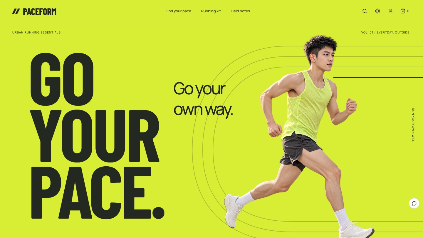
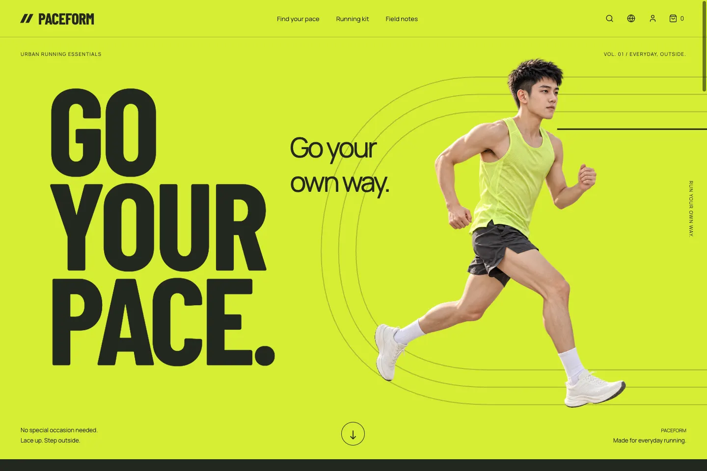
The brand lines are "Go your own way" and GO YOUR PACE. The site reads like an independent running magazine with a sense of speed: big type layered with the runner, track lines guiding the eye, and words about routes, clothing and everyday feelings rather than rankings and results.
Visual language: one shade of go-yellow
Neon yellow is the brand's signal to head out, used on the first screen and at points of action. Paper white carries products and reading. Text on the yellow is always charcoal: charcoal on this yellow has a contrast ratio of about 11.6:1, while white text would be about 1.3:1 and almost unreadable.
- Go yellow
#D7EE35First screen, navigation and points of action - Charcoal
#232820Headings, body text and all text on yellow - Paper white
#F2F1E9Background for products and reading - Olive grey
#606659Secondary text
| Use | Typeface | Why |
|---|---|---|
| Large English type | Barlow Condensed Bold | Condensed bold type carries speed and suits short lines like GO YOUR PACE |
| Body and interface | Manrope, PingFang | Tight headings and relaxed body text, with Chinese carrying feeling and information |
Four signature moments
Start
Go your own way
A neon yellow first screen with GO YOUR PACE behind and the runner in front. As visitors scroll, the runner moves forward slightly and the track lines extend.
Choose a run
Where will you go today?
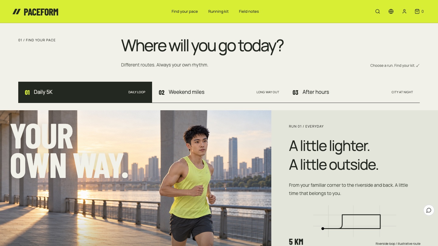
Daily 5K, weekend miles and city night runs. Choosing one switches the copy, the route sketch and the recommended kit together.
Kit
Less to carry, more to go for
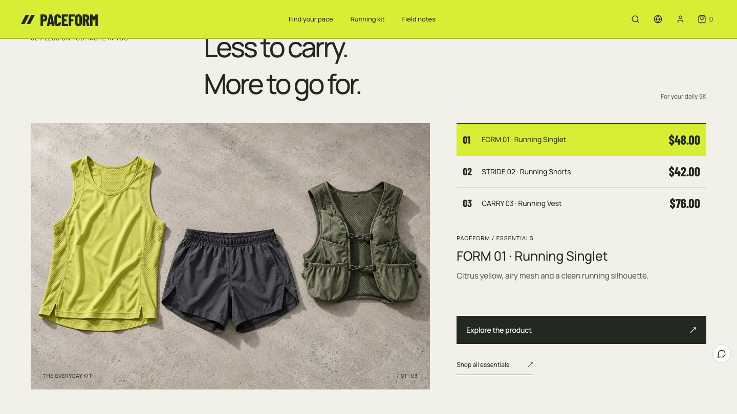
A full still life of the three products sits beside catalog-style entries. Choosing one switches its description, then leads to the product page for colour and size.
Notes
Slow counts as going, too
Morning light over the city and a runner's field note about an ordinary run give visitors who are not ready to buy a reason to stay.
The six-act storyboard
01
Opening: Go your own way
Neon yellow fills the first screen, with oversized GO YOUR PACE layered against a running figure, so speed and ease land at first glance.
02
Runs: Where will you go today?
With "Daily 5K" selected, the panel shows the line for that run, a 5 KM riverside loop sketch and the singlet and shorts recommended for it.
03
Kit: Less to carry
The three products lie together beside priced catalog entries. The selected item is marked in yellow, with a link below to the product and sizes.
04
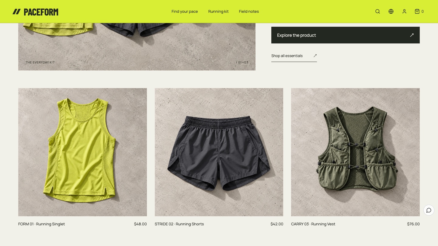
Products: The everyday kit
The singlet, shorts and vest each get a still life with name and price, so they are easy to compare.
05
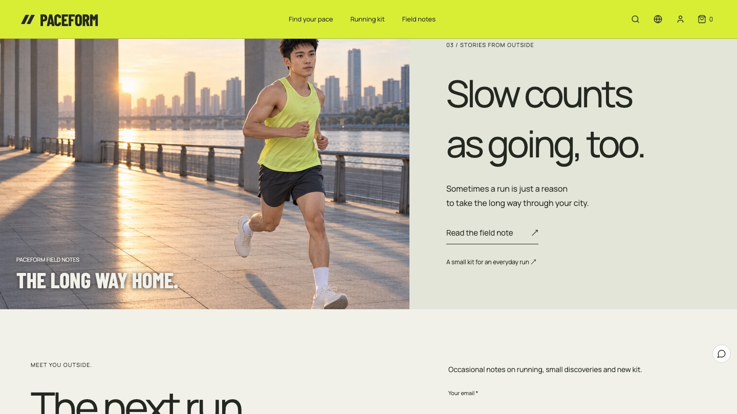
Notes: Slow counts as going, too
A riverside morning run introduces a field note: sometimes a run is just a reason to take the long way through your city, giving the brand everyday warmth.
06
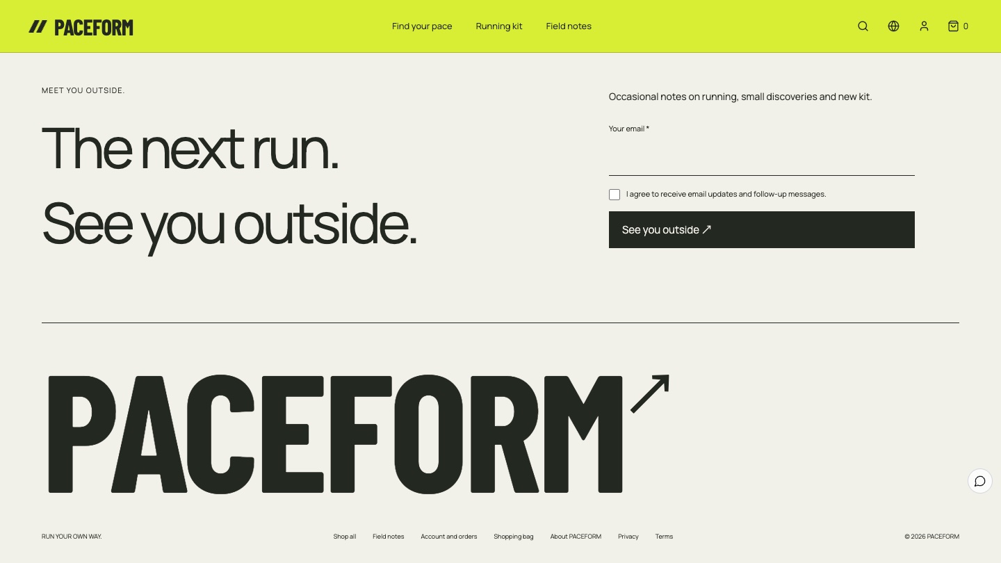
Closing: See you outside
A sign-up form invites visitors to get the next running note, and an oversized PACEFORM wordmark closes the page.
Scenarios instead of categories
The most reusable idea in PACEFORM is replacing categories with scenarios. A daily 5K suggests the singlet and shorts. A 12 km weekend run adds the running vest. Visitors do not need to know about gear first. They only need to answer where they want to run today. The route sketches are labelled as illustrative, so they never pretend to be real running data.
From feeling to order
All three products are real products in Foundax. The singlet and shorts have size variants, and the buttons in the runs and kit sections lead to native product pages, the bag, checkout and orders. The sign-up form and field notes use the platform's forms and content features. With reduced motion turned on, the runner and track lines stay still while switching runs keeps working. To learn more, visit Foundax features.
A checklist you can reuse
- Write so ordinary people feel "I can do this", and keep competitive pressure out of the picture.
- Organise products by use scenario and recommend a complete kit, not just single items.
- Choose one distinctive brand colour and concentrate it on points of action.
- Check contrast for text on bright backgrounds, and use dark text instead of white when needed.
- Give visitors who are not ready to buy a reason to stay, such as a down-to-earth field note.
- Label illustrations as illustrations and never present them as real data.
FAQ
With only three products, will the website feel thin?
Fewer products are easier to tie together with scenarios. Three runs, one kit still life and a field note are enough for a complete, memorable brand website.
Do neon colours hurt readability?
They do if you put white text on them. PACEFORM uses neon yellow only on the first screen and at points of action, sets all text on it in charcoal, and keeps body text and product information on paper white.
Is PACEFORM a real brand?
No. PACEFORM is a fictional brand created by the Foundax team. Shopping and orders in the case are a demo. Nothing is charged or shipped.
Can I start my own website from this design?
Yes. On the PACEFORM case page, choose "Start with this template". After signing up, a website is created from this case, ready for your own products and brand content. For design methods across industries, see the brand website design guide.